Do you notice poor design? For a long time, kids’ toothbrushes were designed to look like shorter adult toothbrushes. This optimized the production process, and no one questioned whether this was the best design. Until 1996, when Oral-B asked the innovation company IDEO to question and redesign toothbrushes for kids based on direct observation. IDEO discovered that kids were using their fists to hold the toothbrush in a power grip since they did not yet have the fine motor skills for an adult-style precision grip. IDEO applied observant and thoughtful design to create fatter, squishy-gripped toothbrushes for kids, which revolutionized the kids’ toothbrush aisle.
Similarly, healthcare design in a cancer care center can have a direct impact on the experience of cancer patients and their companions. Cancer care can be quite stressful. Patients may be fairly healthy or may be immunocompromised. They may be coming into a cancer center for a consultation about an upcoming surgery, for chemotherapy in an infusion bay, for radiation therapy, or to monitor cancer in remission.
Christner employed observation and thoughtful design to optimize the patient experience in the 37,000 SF renovation and expansion for Siteman Cancer Center at Barnes-Jewish St. Peters Hospital. Siteman’s Patient and Family Advisory Committee (PFAC) was involved in the design process, so that the perspectives of patients would be represented. Below are three design concepts that were implemented to create a positive patient experience.
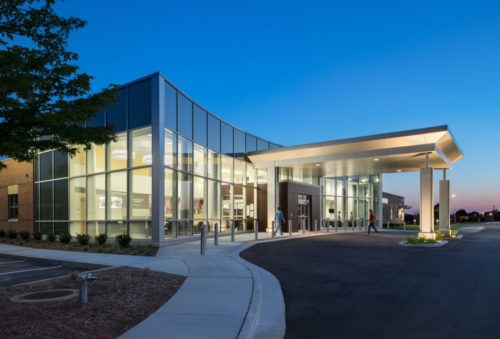
It is important to understand that the patient experience starts from the moment the patient enters the building. As a cancer patient myself at one point, coming in for a surgery consultation, I was worried about my appointment. I was quite thankful for the easy-to-understand, well-marked check-in desk visible from the entry of the building that helped alleviate my anxiety somewhat.
Most cancer patients feel sick or fatigued. Feeling lost or unsure where to check-in when they first enter the building could be quite trying for these patients. At an academic medical center in the south, one study showed that staff spent 4,500 hours annually to help redirect lost patients, resulting in an unexpected additional operational cost of $220k.[1]
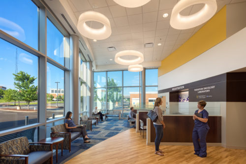
When designing the new Siteman-St. Peters (Barnes-Jewish St. Peters Siteman Cancer Center), our planning and design team incorporated clear signage for patients, directing them to one of two registration desks as they enter the building. These two desks are clearly marked for Medical Oncology (chemotherapy infusion) and Radiation Oncology to help patients orient themselves quickly. Patients who are coming in daily for radiation treatment are given a barcode that can be scanned for fast track registration – no waiting in line.
Creating Options for Waiting
How did you feel the last time you entered a healthcare waiting room? Anxious? Nervous? Calm? Peaceful? Can designing above the code-regulated minimum help alleviate stress for the patient?
As one of the first places in a cancer patient’s journey, waiting areas present an opportunity to help alleviate anxiety, rather than intensifying it. Designing the waiting space to be larger than the minimum allows for multiple types of spaces in which to wait. This can allow patients and their companions choices at the cusp of an experience where they may feel they have very little control. Some patients may want to be somewhere quiet and secluded with no need to make eye contact with others. Others may want to be near a hum of other people to distract them. In my case, the positive distraction of a live piano performance did a lot to alleviate my nervousness.
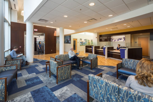
Siteman-St. Peters offers multiple waiting room areas with different environments, empowering patients with choices. A larger double-height waiting area with a TV and groupings of chairs that can be used for families or larger groups for a more-active experience, while a smaller waiting area near the entrance allows for more seclusion.
In a major academic medical center in the southeastern United States, researchers found patients had increased comfort, convenience, and a sense of privacy after they transformed their waiting room. They provided better views of information.
Decentralized waiting rooms can make the waiting experience more serene and less chaotic. At Siteman-St. Peters, a dedicated infusion waiting area has a lower ceiling and a skylight to offer patients a calmer, more sheltered feeling while waiting. Radiation therapy patients have a consultation with their doctor before treatment. Dedicated gowned waiting areas are provided in both the radiation and consultant areas to maintain patients’ dignity throughout the process.
Providing Choices for Infusion
Infusion patients can have treatments that last hours. Fully understanding the time a cancer patient spends while receiving treatment can positively influence the design, thus improving that patient experience. Providing patients the most options and control over their environment in the infusion area is vital in the design of a cancer care center. Some patients may want to sleep and others to talk, while others may want a connection to nature. Providing patients with a variety of options and control over their treatment environment is key to creating the most positive patient experience possible.
By providing a combination of private infusion rooms and semi-private infusion areas, BJSP Siteman Cancer Center provides the patient control over how they receive their treatment. The design incorporated lighting controls in each infusion bay. Power outlets were installed in each divider, allowing patients to charge their devices for positive distraction and connection to the outside world. Privacy curtains were also incorporated to allow for privacy of the patient at their individual bay.
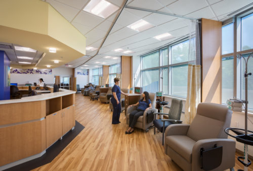
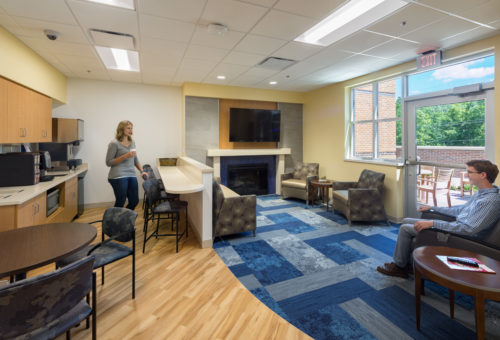
The patient experience does not end with the patient. Giving companions choices also benefits patients. Companions can choose to sit with the patient in guest chairs, use one of the family lounges equipped with a kitchen, fireplace, and large TV, or spend time in an outside garden space.
With observation and thoughtful design, designers can do a lot to reduce patient anxiety, enhance patient experience, and give patients choice.
Interested in learning more about how you can keep in mind the patient experience when designing or planning your cancer care or other healthcare facilities? Contact Rachel for more details.
_______________________________________________________________________________________
[1] Zimring C, The Costs of Confusion: Non-Monetary and Monetary Costs of Emory University Hospital Wayfinding System, Atlanta: Georgia Institute of Technology, 1990

